Have you ever counted the number of clics needed to select a Category on a document in Alfresco? The user interface for the category selection was really hard to understand for a normal user up to in the 2.x series and will be improved in the 3.0 version. This can already be tested in the 2.9 Beta version.
I have worked on a little test with RichFaces to make it better. When I hear that the 2.9 had changed the categories selection I needed to see how it was done... It's better than the previous interface but not yet perfect for me: my test is still useful.
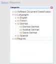
My test presents the categories as a tree in a modal dialog. Here is a screenshot to better understand what I am talking about.
As you can guess this is a test on a blank page... it still needs to be integrated but it looks promising. To make it work I am using a combination of the JSF RichFaces taglib and WebScripts.
The next steps are
- to support list of categories
- to embed all the JSF part into a tag lib to make it easier to embed everywhere
- test it as a replacement for Alfresco standard categories selection UI
That said Alfresco 2.9 has a nice feature around the categories. In the left panel you can show the list of your document sorted in the categories tree...
Useful link: the RichFaces live demo.
